✦ DESIGN CHALLENGE — THE PALACE COMPANY
The MTA's fare system hasn't changed since 1994. A 48-hour design challenge to rethink how millions of daily riders get through the turnstile - without assuming the answer was a better card.
ROLE
Product Designer
SYSTEM
NYC Subway Access
TOOLS
Figma · FigJam · Notion · AI
SCOPE
Access flow · Kiosk Ul · MVP
NOTES
✦ 01 — SITUATION
Before you can ride, you have to solve how to get in.
Six steps stand between a rider and the platform - and every one of them depends on a physical card and machines built for a different era.
Need to travel
Buy/reload
Find machine
Wait
Swipe
Enter
Physical card dependency
"To travel, the rider first has to solve how to get in."
✦ 02 — DESIRE
Riders and business want different things - but a common opportunity sits underneath: making access simpler, faster, and more flexible.
FREQUENT RIDE
"I want to access quickly and continuе my trip."
TOURIST
"I want to easily understand how to access the system."
MTA (BUSINESS)
"I want to reduce friction, infrastructure dependence, and cost."
Riders and business have different needs, but there's a shared opportunity: making access simpler, faster, and more flexible.
✦ 03- CONFLICT
Every stakeholder wants something different - but the same root cause sits underneath all three: friction that starts before the turnstile.
• PROBLEM
Dependence on a physical card and specialized infrastructure.
• EVIDENCE
Lines, reloads, damaged cards, and out-of-service machines.
• INSIGHT
The greatest friction happens before crossing the turnstile.
KEY INSIGHTS
The rider doesn't want to buy a card; they want to start their trip · A physical object drives both rider friction and MTA operating cost - same cause, two impacts · Going digital doesn't mean excluding: different riders need different ways in.
✦ 03- CONFLICT
Subway access still depends on a physical card and infrastructure built for a different technology. The MTA carries the cost; riders carry the friction - before they've even started their trip.
PROBLEM STATEMENT
The NYC subway's access experience depends on a physical card and infrastructure designed for a different technological context — forcing riders to buy, reload, or hold onto a card before they can travel, while the MTA maintains costly infrastructure that's hard to evolve.
HOW MIGHT WE
Let both daily riders and tourists get into the subway fast and intuitively, without depending on a physical card — while cutting the operational costs tied to the MTA's current infrastructure?
✦ 04 — CHANGE
One ecosystem, three credentials, same validation.
Rather than eliminate the physical card, the system stopped requiring just one. Bank card, digital wallet, or physical card — all validated through the same NFC read at the turnstile.
NFC tap validation
Enter subway
MVP SCOPE — IN
NFC-compatible access · Tap & Go validation · Instant visual + audio feedback · Usage and adoption metrics.
MVP SCOPE — OUT
Full mobility app · Route planning · Trip history · Service notifications.
✦ 04 — CHANGE
Rather than duplicating screens for every flow, I designed the kiosk purchase flow once and reused its logic for reload - putting the real design effort into the turnstile states.


Figma-generated exploration used as visual starting point - not the final design system. In a real scenario, components would evolve for kiosk context: sizing, touch targets, distance-legible type, and accessibility.
✦ 04 — CHANGE
The turnstile is where the whole system either works or fails in 2 seconds. Each state tells the rider exactly what happened and what to do next.

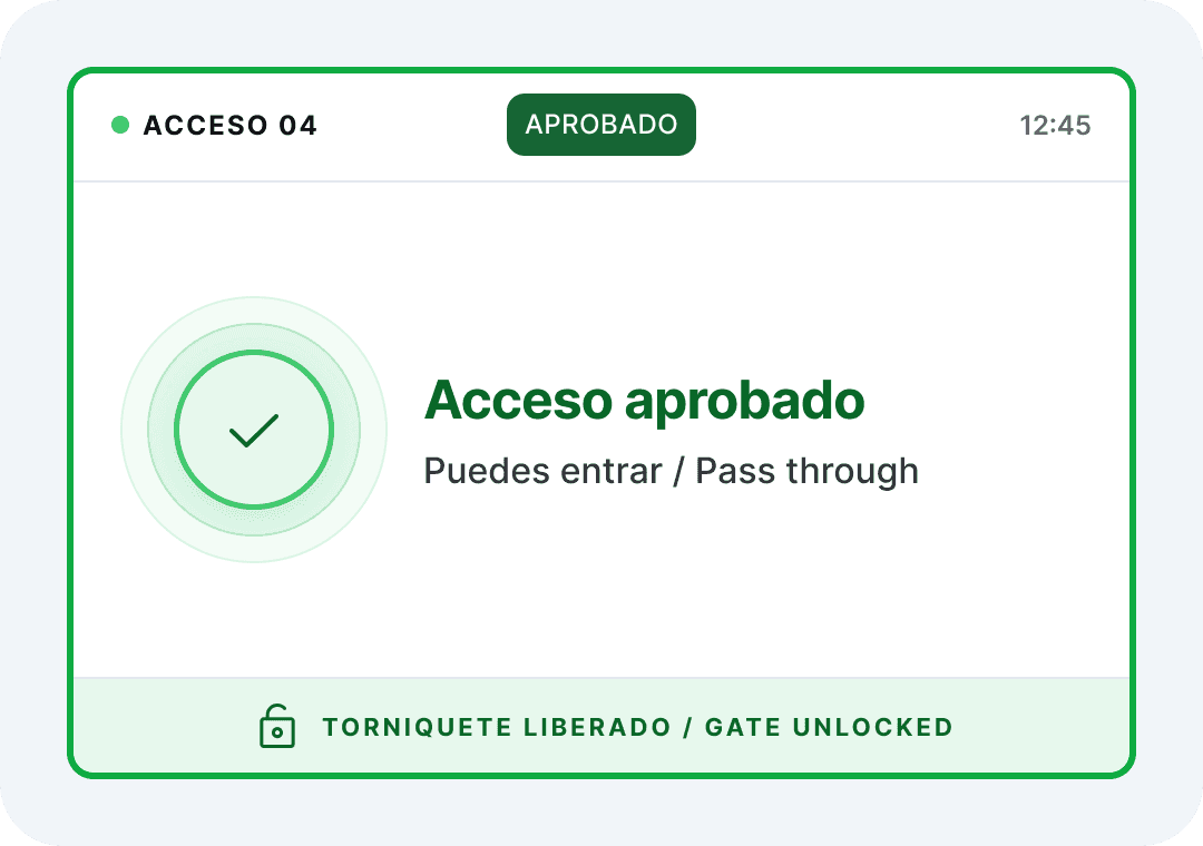


Same structure, different states: hierarchy stays consistent, while color, iconography, and message let riders identify what happened and what's next - instantly, without reading twice.
✦ 05 — BUILT TO BE MAINTAINED
This is a hypothesis, not a shipped result - yet.
Presented as evidence to validate, not a finished product. What I'd track first: average access time, first-tap success rate, validation error rate, and credential adoption - across riders, tourists, and low-tech-familiarity users.
RIDER
Less friction · Faster access · More flexibility · More clarity and trust.
MTA
Less physical infrastructure · Lower maintenance cost · Higher scalability · Lower fraud potential.